
Pontus Karlsson
Product Photo Color Accuracy: Why Your Packaging Looks Wrong Online
If your product looks the right color in the studio and wrong on the product page, the cause is almost always one of four things: mixed lighting, auto white balance, an untagged export, or a screen you have never calibrated. Fix them in that order. The first two are free and account for most of the drift.
Color is the part of the packaging a customer recognizes before they read the name, and it is the reason returns get filed with the words "not as pictured".
What counts as an accurate color?
Color difference is measured as Delta E (ΔE), a single number for the distance between two colors. The thresholds are well established in color measurement, and Konica Minolta's reference on ΔE puts them like this:
- ΔE below 1 — imperceptible to the human eye
- ΔE 1 to 2 — barely noticeable under close inspection
- ΔE 3 or more — clearly visible, and often unacceptable
CIEDE2000 (ΔE00) is the formula to use. It weights lightness, chroma and hue separately so the number tracks what people actually see.
The practical version for a brand: a customer comparing your product page to the tube in their hand will not notice a ΔE of 1. They will notice a ΔE of 3. Most uncorrected product photography lands well past 3, because a single wrong white balance can shift an entire image by more than that.
Why does my product look a different color online?
Mixed light sources
A window on one side and a tungsten lamp on the other gives you two color temperatures in one frame. No white balance setting fixes both. One side of the packaging goes warm, the other goes cool, and neither matches the swatch.
Kill every light you are not controlling. Close the blinds or turn off the overheads. One light family, one temperature.
Auto white balance
Auto white balance guesses, and it guesses differently on every frame. Shoot a red sauce jar and the camera compensates by pulling the whole image toward cyan, because it assumes the scene should average to neutral. Your brand red comes out muted.
Set a custom white balance off a gray card under your actual lighting, then lock it for the whole session. This is the highest-return thirty seconds in product photography.
Colored surfaces bouncing into the shot
A white product sitting on a wood table picks up warm bounce along its lower edge. Photographers call it a color cast; a brand manager calls it "our white looks yellow". Use a neutral surface, or flag the bounce with white card.
An untagged or mismatched export
An image that carries no color profile gets interpreted by whatever is displaying it. Browsers and marketplace listings assume sRGB. If you edited in Adobe RGB or ProPhoto and exported without converting, the saturated parts of your packaging will render flat and slightly wrong on every device.
Convert to sRGB on export and embed the profile. Neither Amazon nor Shopify publishes a color-space requirement, which is exactly why the web's own default is the safe answer.
What do Amazon and Shopify actually require?
Both platforms demand accurate color, and neither tells you what color space to deliver it in.
Amazon's Product image guide, verified 15 August 2026, says the image must be one that "accurately represents the product as a realistic, professional-quality image" and that it "should accurately represent the real scale, quantity, and color of the product." It also requires a main image with "a pure white background (RGB color values: 255, 255, 255)" and says to "show the product as 85% of the image", at a minimum of 500 pixels and a maximum of 10,000 pixels on the longest side.
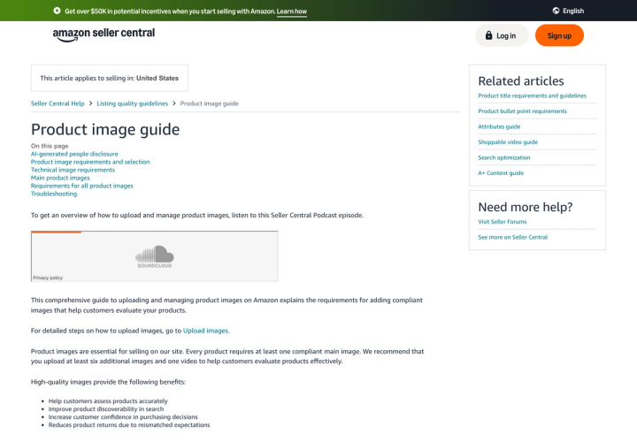
That 255, 255, 255 requirement is stricter than it looks. A background that photographs at 250 rather than 255 reads as pale gray against Amazon's white page, and the product looks like it is sitting in a faint box. Overexpose the background deliberately, and check it with the eyedropper rather than your eye.
Shopify, verified the same day, recommends PNG first and JPEG second, caps images at 5000 x 5000 px or 25 megapixels and 20 MB, and says "for square product images, a size of 2048 x 2048 px usually displays best." No color-space rule there either.
So compliance on color is entirely on you. Our breakdown of product image requirements across every marketplace covers the specs each platform does publish.
How do you shoot for accurate color?
Five steps, in order of how much they matter.
- One light temperature. Eliminate mixed sources before you touch a setting.
- Custom white balance off a gray card. Shoot the card in the first frame under the lighting you will use, set white balance from it, lock it.
- Include a color reference in the first frame. A color checker chart in one test shot gives you a known target to correct against later. Shoot it, then remove it.
- Shoot raw. A raw file lets you change white balance after the fact with no quality loss. A JPEG bakes the wrong decision in.
- Keep the physical product on set. The final check is holding the packaging next to a calibrated screen.
For the lighting setup around all of this, our guide to lighting, angles and props goes deeper on placement.
How do you keep color right after the shoot?
Calibrate the screen you approve on. An uncalibrated monitor is a random offset applied to every decision you make. A hardware calibrator is a one-time purchase and it is the difference between correcting color and guessing at it.
Correct to the reference, not to taste. Use the gray patch on your color checker to neutralize, then compare the brand color patch against its known value. Taste is what drifts between SKUs.
Convert to sRGB and embed the profile on every export.
Check the same file on a phone. Most of your customers are on one, and mobile screens run more saturated than desktop.
Spot-check the live listing. Marketplaces re-compress uploads. Look at the product page, not your export folder.
Where does AI generation drift on color?
Our own category performs worst here, so here are the specifics.
General-purpose image models treat your packaging as a suggestion. Ask one for a lifestyle shot of a mint-green bottle and you will get a bottle that is mint-green-ish, in a slightly different mint on every generation. The label text softens, the cap changes shade, and none of it is stable across a batch. For a brand whose color is trademarked or Pantone-matched, that is the same misrepresentation problem Amazon's guideline is written about.
The test to run on any AI tool before you trust it with a catalog: generate the same SKU five times, sample the brand color with an eyedropper in each output, and see how far apart the five samples are. If they scatter, the tool is inventing your color rather than carrying it.
That test is why we built Pikes AI to generate from a brand's actual product images rather than from a text description of them. The reference is the real SKU, so the color has something to hold onto.

The advice holds whichever tool you use: sample the output, compare it to the physical product, and reject anything you would not put on a shelf. If you are weighing whether generated imagery is allowed at all on your channels, we covered that in are AI-generated product images allowed.
Frequently asked questions
What color space should I use for product photos?
sRGB, converted and embedded on export. Neither Amazon nor Shopify publishes a color-space requirement as of 15 August 2026, but browsers and marketplace pages assume sRGB, so an untagged or wide-gamut file will render unpredictably.
What Delta E is acceptable for product photography?
Aim for under 2. Below 1 is imperceptible, 1 to 2 is barely noticeable under close inspection, and 3 or more is clearly visible to a customer comparing your photo to the product.
Why does my white background look gray on Amazon?
Because it is. Amazon requires RGB 255, 255, 255 for main images, and anything below that reads as gray against the page. Check the actual pixel value with an eyedropper instead of trusting your eye.
Do I need a color checker chart?
Not for every shoot, but for every lighting setup. One test frame with a chart gives you a known reference to correct the whole session against. A gray card alone handles white balance and is the minimum.
Will shooting raw fix my color problems?
It fixes the recoverable ones. Raw lets you reset white balance after the fact with no loss. It does not fix mixed lighting, colored bounce, or a screen you have not calibrated.
Can AI-generated images match my brand color?
Only if the tool is working from your real product images rather than a text prompt. Test it by generating the same SKU five times and sampling the color in each output. If the samples scatter, the model is guessing.
Create your next product image set
Use your product photos and brand context to create studio-style and lifestyle variations in Pikes.
AI product photography with PikesCompare plans and generation credits