

Mike Lehman
How to Photograph Product Labels So the Text Stays Readable
A line of 2mm legal type on a 6-inch bottle lands at roughly 11 pixels tall in an image shot to Amazon's minimum recommended size of 1,000 pixels. Label text fails in three predictable places: depth of field, specular glare, and export. All three are fixable before the shoot ends.
Why does label text go soft in product photos?
Because a label is the hardest thing in the frame and it usually gets the least attention.
Everything else in a product shot is forgiving. A cap can be slightly soft and nobody notices. A background gradient can shift half a stop. Type cannot. Small text is the highest-frequency detail on the product, so it is the first thing lost to a wide aperture, a soft light source, an aggressive downscale, or a JPEG save. It is also the thing a customer uses to decide whether the product is what they think it is.
The failure is also invisible where most people look at it. On a 400-pixel thumbnail a mushy ingredient panel reads as texture. It reads as texture right up until someone opens the zoom view.
How many pixels does your label text actually need?
Work backwards from the platform, then from the product.
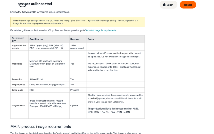
Amazon's product image guide sets the frame. Images below 500 pixels on the longest side cannot be uploaded at all, the maximum is 10,000, and the line that matters is this one: "We recommend 1,000+ pixels for the best customer experience. Images with 1,000+ pixels on the longest side enable the zoom function." Amazon also asks you to "show the product as 85% of the image."
Put those two rules together on a real SKU. A 6-inch (152mm) bottle occupying 85% of a 1,000-pixel frame is about 850 pixels tall. A 2mm line of ingredient copy on that bottle is 2/152 of its height, which works out at roughly 11 pixels. That is our arithmetic from Amazon's own numbers rather than a published standard, but it is the number your label is living on.
Eleven pixels is survivable for clean sans-serif type and marginal for anything with fine strokes. At the 500-pixel floor the same line is under 6 pixels and gone.
Three practical consequences:
- 1,000 pixels is a floor, not a target. Shoot at the sensor's native resolution and downscale once, at the end. Shooting to the minimum leaves you nothing.
- The smallest type sets the spec, not the product. A 2-litre detergent bottle with a big wordmark is easy. A 15ml serum vial with a six-point ingredient list is the one that dictates your capture resolution.
- Zoom is where the label is read. If you are below the zoom threshold you have removed the only view where the text was legible anyway.
Marketplace requirements diverge past that point. We put the full set side by side in product image requirements for every marketplace.
What camera settings keep a curved label sharp?
The trap on cylindrical packaging is that the label is not flat, so it is not all on the same focal plane.
On a 60mm-diameter bottle, the centre of the front panel and the point where the label curves out of view can differ by 20mm or more in distance from the sensor. Focus on the centre at f/4 and the edges of the panel go soft, which is exactly where the wrapped text sits.
- Stop down until the whole panel holds. f/11 to f/16 on a macro or short telephoto is a normal working range for a bottle. Past f/16 on most sensors, diffraction starts costing you the fine strokes you stopped down to keep.
- Focus on the label, not the front of the pack. Set the focus point on the smallest block of type, not the cap or the front edge. Live view at 100% magnification, not the viewfinder.
- Shoot longer than you think. A 90-100mm macro flattens the curve compared with a 35mm, so less of the panel falls away from you. Wide lenses close in also distort the type at the edges.
- Focus stack when one aperture will not do it. For deep or heavily curved packs, three to five frames focus-stacked beats hunting for a magic f-stop.
- Kill the shutter vibration. At f/16 the exposure runs long enough that a cable release or a two-second delay is the difference between 11 sharp pixels and 11 smeared ones.
How do you stop glare from erasing the type?
Most modern CPG packaging is gloss-laminated, foiled, or shrink-wrapped, and all three throw specular highlights straight back at the lens. A highlight sitting across a line of text does not soften it. It deletes it.
- Make the source big and put it off-axis. A large softbox or scrim at 45 degrees, feathered so the hot centre falls beside the label rather than on it.
- Use a polariser, but check what it costs. A circular polariser will kill most laminate glare. It also darkens the shot by a stop or two and can flatten the finish so far that a gloss pack looks matte, which is its own misrepresentation.
- Flag the reflection, don't fight it. Black card either side of the bottle reads as dark edges on the curve and pulls the specular band into a narrower strip you can position.
- Watch white-on-metallic. White or silver type on foil is the hardest combination in CPG and often needs the label lit separately from the pack, then composited.
Reflective and transparent packaging has enough of its own rules that we treated it separately in photographing glass and reflective products.
What does export do to small text?
More damage than most teams realise, and Amazon is unusually direct about it.
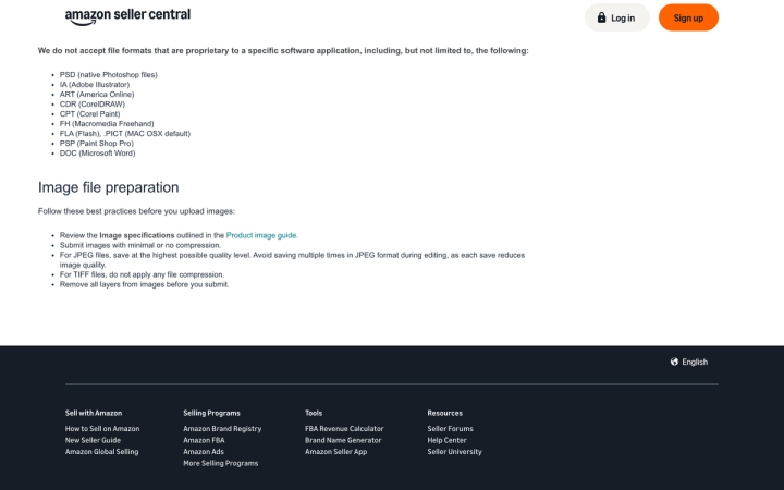
Its technical image file requirements page asks you to "submit images with minimal or no compression" and, for JPEGs, to "save at the highest possible quality level. Avoid saving multiple times in JPEG format during editing, as each save reduces image quality." For TIFFs: "do not apply any file compression."
That middle instruction is the one catalogues break. A file that goes camera → retoucher → shared drive → resizing script → marketplace upload has often been through four generational JPEG saves, and JPEG discards high-frequency detail first. High-frequency detail is your type.
Four rules that hold on any platform:
- Edit in a lossless format and export to JPEG once, at the end, at maximum quality.
- Downscale once, from the master. Repeated resizes compound softening.
- Sharpen after resizing, not before, and check at 100%. Over-sharpened small type grows halos that read as a printing defect.
- Convert to RGB before upload. Amazon lists CMYK as "not preferred" and tells you to convert; it also says not to rely on ICC colour profiles for accurate display. Colour handling and text legibility fail together more often than separately, which we covered in product photo colour accuracy.
Where AI generation breaks label text
This is where AI image tools are weakest.
A general-purpose image model asked for "a matte black serum bottle with gold lettering" produces a beautiful bottle with lettering that looks like type from three feet away and dissolves into letter-shaped marks at 100%. It is not reproducing your label; it is inventing something label-shaped. Generate the same prompt three times and the wording changes between outputs.
On a product detail page that goes past styling. Ingredient copy, net weight, and warnings are regulated text, and an image showing the wrong ones is a misrepresentation before it is anything else.
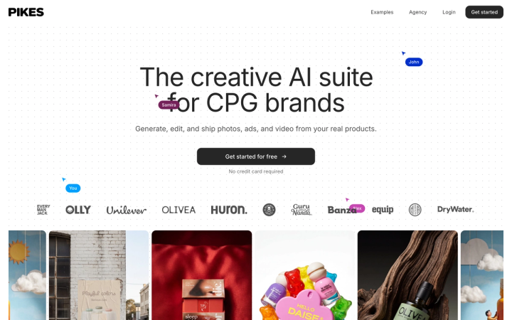
It is why we built Pikes to generate from a brand's actual product files rather than from a text description of them, since a model given the real pack has less room to invent the panel. The test that settles it is tool-agnostic, ours included: generate your hardest SKU three times, open all three at 100%, and read the smallest line on each. If the wording moves between generations, the tool cannot carry your detail pages, whatever else it does well.
That check gets harder to run by hand as the catalogue grows, which is why we wrote up running product photography across large catalogues separately.
A five-minute check before the images ship
Run this on the hardest SKU in the batch, not a representative one:
- Open at 100% and read the smallest line of type out loud. If you cannot, nothing downstream fixes it.
- Check the same line at the far left and far right of the curve, not just the centre.
- Look for a specular band crossing any text.
- Confirm the longest side clears 1,000 pixels after the final resize, not before it.
- Check the file has been saved to JPEG exactly once.
- Compare the brand colour against the physical pack under neutral light.
To create new scenes from your own packaging photos, explore AI product photos for supplement brands or beauty product photography with Pikes. Use the label check above on every result, and keep the original photo or make a controlled edit when generated text does not match the product.
FAQ
How many pixels tall does label text need to be to stay readable? There is no published standard. Working from Amazon's 1,000-pixel zoom recommendation and its 85%-of-frame rule, a 2mm line on a 6-inch pack lands near 11 pixels, which is about the practical floor for clean sans-serif type. Fine serifs and thin strokes need more, so capture higher and downscale.
What aperture should I use for a curved product label? f/11 to f/16 covers most bottles and jars at typical product distances. Beyond f/16 diffraction begins softening the same fine detail you stopped down to protect. If one aperture will not hold the full panel, focus stack instead of pushing further.
Does a polarising filter help with label glare? Yes, on laminated and foiled packaging. The trade-off is one to two stops of light and a finish that can look flatter than the real product. Check the result against the physical pack before committing the batch.
Why does my label text look worse after uploading than in Photoshop? Usually generational JPEG compression. Amazon explicitly warns against saving multiple times in JPEG during editing because each save reduces quality, and small type is the first detail lost. Edit lossless, export once.
Do I need 300 dpi for marketplace product images? No. Amazon requires at least 72 dpi and judges size in pixels, not dpi. The dpi field is metadata for print; pixel dimensions on the longest side are what determine whether your label is readable on screen.
Can AI tools reproduce label text accurately? Tools that work from your uploaded product file do far better than tools generating from a text prompt, which invent plausible type. Test it rather than trusting it: three generations of your hardest SKU, opened at 100%, with the smallest line read on each.
Create your next product image set
Use your product photos and brand context to create studio-style and lifestyle variations in Pikes.
AI product photography with PikesCompare plans and generation credits

Written by
Mike Lehman
Mike Lehman is a senior content strategist at Pikes. Before joining Pikes, Mike spent nearly a decade working with Glossier, Haus, and Athletic Brewing, leading campaigns that blended storytelling and data.