
TL;DR
- AI made creative volume cheap. The hard part now is exploring lots of directions without ending up with what looks like five different brands.
- The fix is a brand world: lock the pack, anchor every image to one theme, and vary the style on purpose.
- We walk through it with a flavor world for Pikes Cherry Blossom, a fictional soda: 1 can, 9 reference styles, two rounds with the Pikes agent, six finalists.
- Steal the 8-step workflow and the copy-paste agent brief below.
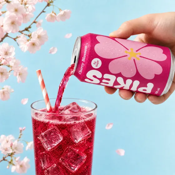
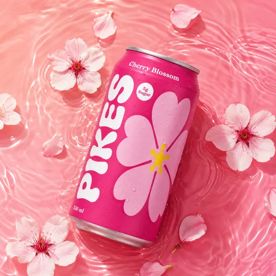
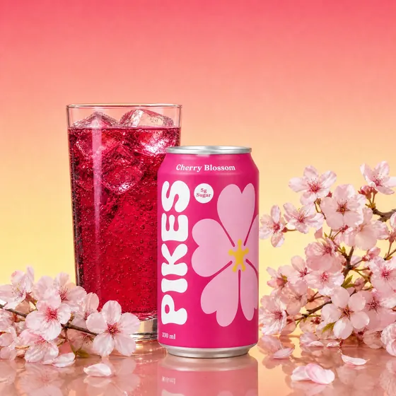
AI has made exploring creative directions almost free. A brand team can try nine looks for a new flavor in an afternoon, where a photoshoot might cover one or two.
Most teams explore badly, in one of two ways. Some prompt at random and end up with a pile of images that look like five different brands, full of the model's defaults: the same porcelain vase, the same mid-century kitchen, golden hour on everything. Others lock one look too early and get 200 versions of the same shot. Neither gives a creative director real options to choose from.
A brand world sits in between. You fix two things: the pack, which has to be exactly right in every image, and the world, a theme that belongs to this product. For a drink, that's usually the flavor: its ingredients, colors, textures and mood. Then you vary the style on purpose, across very different references. The styles give you range. The world makes that range read as one brand.
As with most AI creative, quality comes from what you feed the model far more than from how cleverly you word the prompt.
The brand world framework
Every image in a brand world is built from three layers. Two stay fixed. One moves.
The exact pack from every angle, its real size, and what comes out of it. It never gets redrawn. If the label is wrong, nothing else about the image matters.
The sensory story the brand owns. For a beverage, the flavor: hero ingredients, the liquid, a palette that works with the pack. For skincare, scent and texture. For laundry, freshness.
The look of each shot: composition, set, light, camera, energy. This is where you want range.
The world is what makes nine different styles feel like one brand. The pack truth is what makes each of them usable. What you're after is a shortlist of real directions to guide the AI agents for world building.
Field study: a flavor world for Pikes Cherry Blossom
Pikes Cherry Blossom is a fictional soda we made up for this guide. We wanted to explore its flavor world and bring the taste of the drink to life. It runs in eight steps, and the four pages of the project canvas follow the same order, so keep it open in another tab.
Lock the pack truth
Goal: give the model everything it needs to reproduce the pack exactly, in any scene.
What to do: photograph every side of the pack in high resolution, with good light. Add a scale reference, ideally the product in someone's hand. (No in-hand photo? Generate one and have someone confirm the size reads right before you go further.) Then add a contents reference. For a drink, that's the real liquid color. Without it, “cherry soda” becomes whatever red liquid the model imagines.
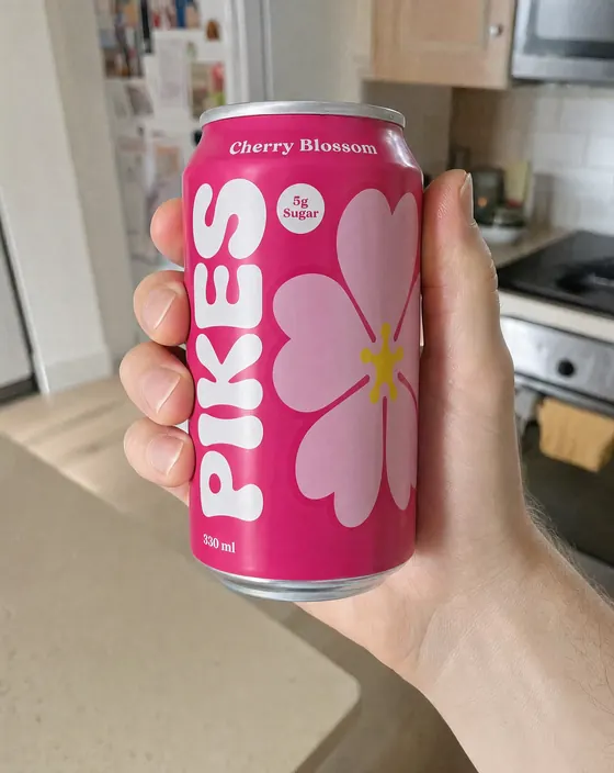
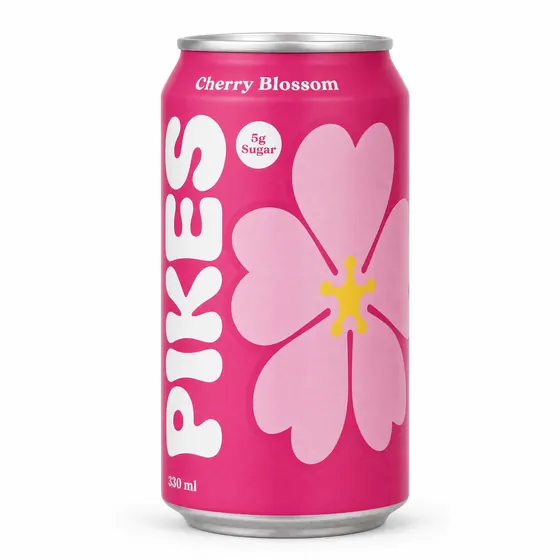
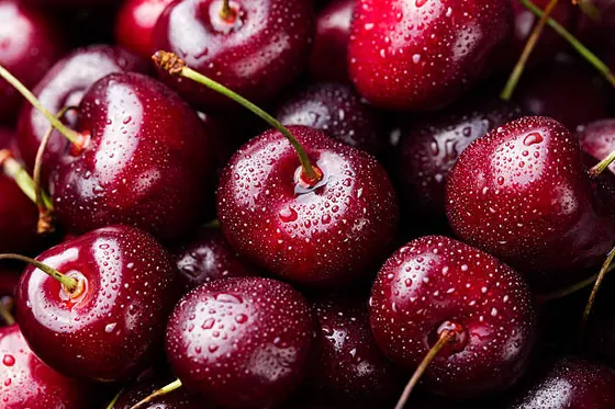
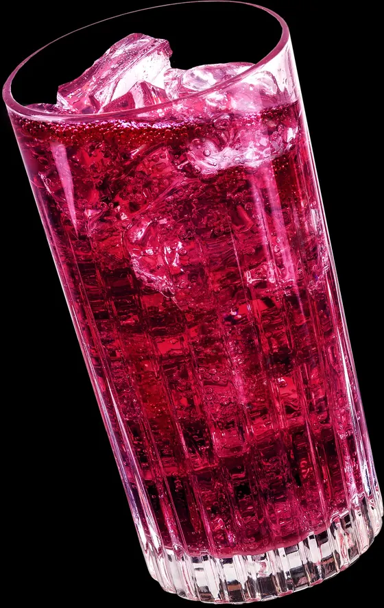
The inputs: scale in hand, the can, the flavor, the real liquid color.
Define the world
Goal: decide what every image has to express before you look at a single style reference.
What to do: write a short brief, one line each: hero ingredients, what the product looks like out of the pack, a palette pulled from the pack itself, textures and props, the mood in three words, the things that would break it (your forbidden invents), and the claims printed on the pack that must stay exact.
In the sample: cherries and cherry blossoms. The real liquid color. Pinks from the can, with white and the flower's yellow as accents. Petals, rippling pink water, condensation, a regular glass.
Build a style board
Goal: go wide on purpose.
What to do: pick 6 to 9 references that are deliberately different from each other. Cover a range of camera angles (overhead, eye level, macro), sets (studio, tabletop, water, outdoors), light (soft, hard, backlit) and energy (a still life vs. a pour or a hand in frame). Pull them from Pinterest, editorial, competitor ads and your own past shoots, for internal exploration only. Then save the board. You'll reuse it for the next flavor.
In the sample: nine references that all bring a flavor to life in different ways, from pouring the liquid to a can sitting on ice among its ingredients.
Brief the agent
Goal: one brief that carries every input, every rule and every setting.
What to do: select everything on the canvas (pack renders, flavor and liquid references, the scale shot and the style board) and send one message. Here's the exact brief from the sample:
It names every input, sets a number of concepts per reference, ties every image to the flavor, sets a color rule relative to the pack, and fixes the model, resolution and ratio. The last line does the most work: the agent comes back with questions before it spends a single credit.
Here's a fill-in version for your own product:
Generate initial concepts
Goal: see what each style can do with your world.
What to do: ask for a set number of concepts per reference. One is too few to judge a style, and many more flood your review. Generate 2 to 4 outputs per run and pick the best. Choosing costs less than endless re-prompting.
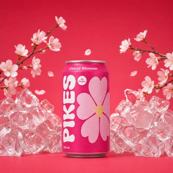
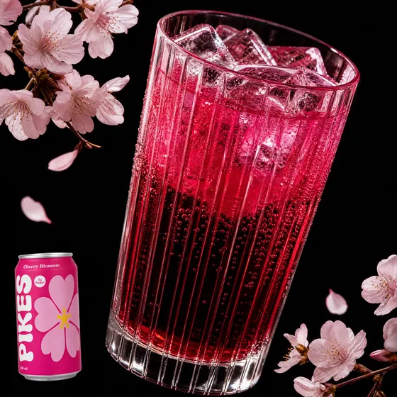
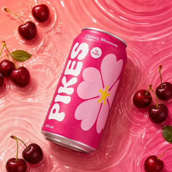
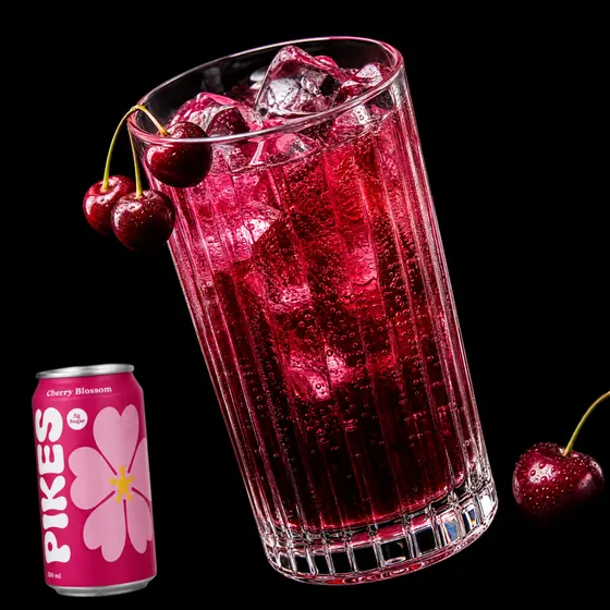
Round one. Strong directions, but the liquid color drifts where the liquid reference wasn't attached.
Fix only what failed
Goal: tighten the world without starting over.
What to do: write one short note that adds whatever was missing and names whatever is banned. Redo only the misses. In the sample, round one missed on the liquid color. Here's the note we sent:
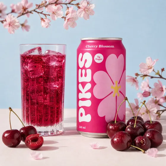
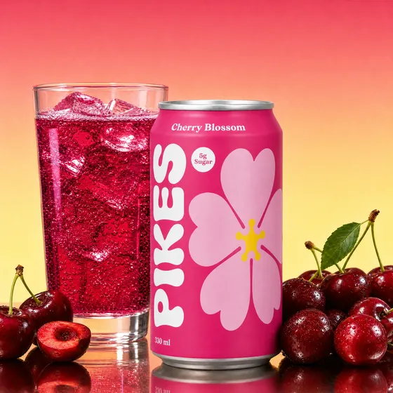
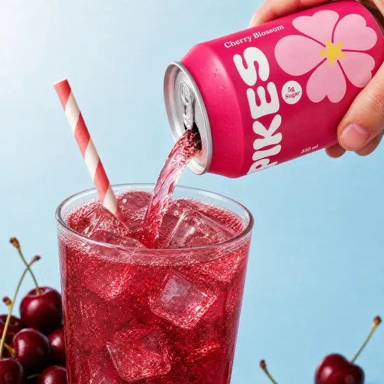
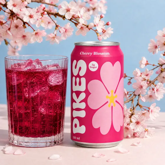
After the note: the real liquid color, in a regular glass.
That note is the whole framework in miniature. The liquid shots were missing their contents reference, so it adds one. And it redoes only what failed, which saves credits and leaves the good concepts alone.
Review and shortlist
Goal: pick the directions worth producing, without letting a wrong pack slip through.
What to do: review in two passes. Truth first: is the pack exact, are the claims intact, is the liquid right, are there any forbidden invents? That pass is pass or fail. Then taste: which directions go forward.
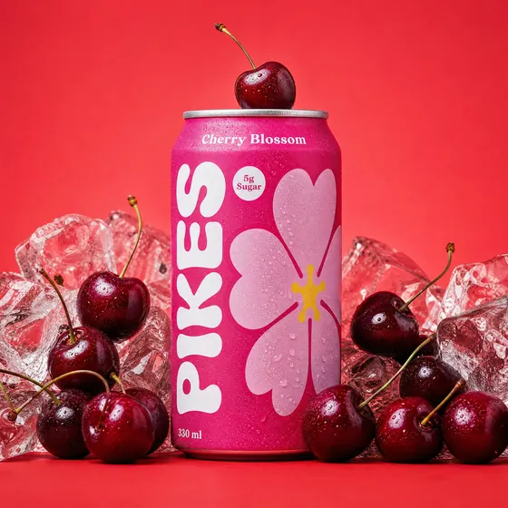
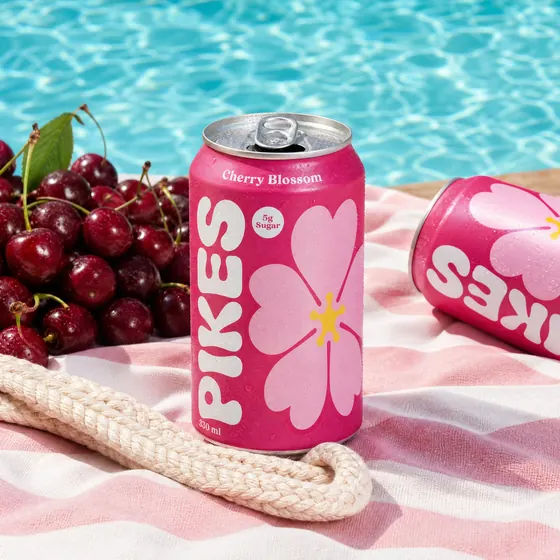
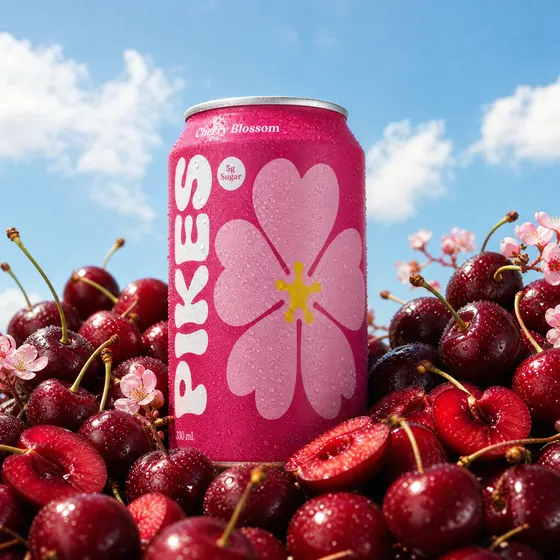
The six finalists, tagged and commented on right on the canvas.
Every rejection became a rule, too. The martini glass is now banned from every future Cherry Blossom brief.
Produce from the shortlist
Goal: turn finalists into ads without breaking the pack.
What to do: turn a finalist into an editable frame and put the headline on its own layer. Expand to 1:1, 4:5 and 9:16 and check the Meta safe zone. Budget a Photoshop pass for small label text. Then send everything to Figma, a board or another project.
In the sample: the editorial can shot becomes a “New Flavor Drop!” ad, then gets resized and exported to a Pikes board or Figma.
Parting thoughts
Flavor is one kind of world. For supplements, the world is the gummy or powder flavor and the key ingredients. For personal care, it's scent notes and formula texture. For home and laundry, it's scent and freshness.
AI didn't make creative direction less important. It made it most of the job. The model will give you as many images as you ask for. It won't decide what stays fixed and what gets to move. Taste should not be outsourced to AI.
Questions
What is a brand world in AI creative?
A setup with three layers: the pack, which stays exact in every image; the world, one theme the product owns, such as its flavor; and the style, which you vary on purpose. The world is what makes very different styles read as one brand.
How many style references should I use?
6 to 9, chosen to be deliberately different in camera angle, set, light and energy. Ask for 2 concepts per reference so you can judge each style.
Which Pikes model should I use to explore a brand world?
Consistency Pro at 2K when the pack has to stay readable. Creativity Pro at 4K is stronger on photorealism but holds label text less well.
Copy the setup for your brand
Open the canvas to see the whole exploration, then run the same eight steps on your product. Questions: leo@pikes.ai