

Mike Lehman
How to Composite a Product Into a Scene So It Looks Real

A composite reads as real when five things agree between the product and the background plate: camera height, lens perspective, light direction, light hardness, and colour temperature. Get those five right and a rough cutout will pass. Miss one, and no amount of retouching rescues it. Light direction is the one people miss.
Compositing is how most brands get lifestyle imagery without a location shoot: photograph the product once on a clean surface, then place it into a kitchen counter, a bathroom shelf, a picnic blanket. Done well it is invisible. Done badly it produces the uncanny look every shopper recognises without being able to name it.
What makes a composite look fake?
Almost always one of six things, and they are diagnosable. Look at a bad composite and work down this list in order.
| What looks wrong | Usual cause | Fix |
|---|---|---|
| Product seems to float above the surface | No contact shadow | Add a tight occlusion shadow where the base meets the surface |
| Product looks stuck on top of the photo | Light direction disagrees | Match the lit side of the product to the lit side of the scene |
| Edges look cut out with scissors | Hard selection, no edge treatment | Feather about one pixel, remove the light halo, match the plate's focus |
| Product is sharper than everything around it | Depth of field disagrees | Blur the product to match the plate at that distance |
| Colour feels slightly off | White balance disagrees | Match colour temperature to the scene before anything else |
| Scale reads wrong | Camera height disagrees | Put the product's horizon line where the scene's horizon line is |
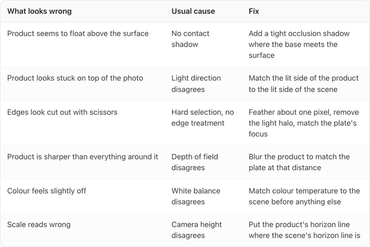
The order matters. Fixing edge quality on a composite whose light direction is wrong is wasted work, because the eye reads lighting long before it reads edges.
How do you match the camera angle?
Find the horizon line in the background plate, then shoot the product from that same height.
If the plate was shot at counter height looking slightly down, you can see a sliver of the countertop surface. Your product shot has to show the same sliver of its own top. Photograph the bottle straight on at dead eye level, drop it into a counter scene shot from above, and the label will look correct while the cap looks wrong. Nobody will say "the camera height is off." They will say it looks weird.
Lens matters less than height but is not free. A background shot wide at 24mm has visible perspective distortion at the frame edges; a product shot at 100mm has almost none. Placing a flat-perspective product near the edge of a wide plate makes it sit oddly. Keep composites toward the centre of a wide plate, or shoot your product at a focal length close to the plate's.
The cheapest fix is upstream: when you shoot the product, shoot it at three heights (level, 15 degrees down, 30 degrees down). Then you have a matching angle for most plates you will ever use, and you never re-shoot.
How do you match light direction and hardness?
Direction first. Find the shadows in the plate and trace which way they fall. If the scene's shadows run to the right, the light is coming from the left, and your product needs its highlight on the left and its shadow side on the right.
Then hardness, which is what the picture above is really about. Those shadow edges are razor sharp with a hard transition from light to dark, which means a small, distant, undiffused source: direct sun through a window. A product lit with a big softbox has soft gradients and a shadow that fades over an inch or more. Drop that product into this scene and it will look wrong even with the direction correct, because its shadow disagrees with every other shadow in the frame.
Hardness is set by the size of the light relative to the subject. Sunlight is hard because the sun is tiny in the sky. A 4-foot softbox 18 inches from a bottle is enormous relative to the bottle, so it is very soft. To match a hard scene, shoot the product with a bare speedlight or a small reflector and no diffusion. To match a soft, overcast, north-window scene, use the big softbox.
A shortcut that costs nothing is to keep two lighting setups for every SKU, one hard and one soft. Most plates fall into one bucket or the other.
What shadow does the product actually need?
There are two shadows, and they do different jobs.
The contact shadow (or occlusion shadow) is the dark, tight, nearly black line right where the product touches the surface. It is small and it is the single most important pixel-level detail in the whole composite. Without it the product floats, no matter how good everything else is.
The cast shadow is the larger shape thrown away from the product in the direction opposite the light. It carries direction and hardness information, and it should fade and soften as it gets further from the object.

Look at where the vase meets the table above. The shadow is darkest and tightest at the contact point and opens up and lightens as it travels left. That gradient is what the eye is checking. A uniform grey blob under a product is the most common tell in bad e-commerce compositing, and it is more obvious than a bad cutout.
If the surface is glossy you need a reflection as well as a shadow, falling directly below the product, dimmer than the product and fading with distance. We go deeper on building both in our guide to product photo drop shadows. Reflective and transparent products have their own rules, covered in glass and reflective product photography.
How do you keep colour from giving it away?
Match white balance to the scene, then check the product against the real thing.
Every environment tints what is in it. A product on a wooden table in late-afternoon light picks up warmth; the same product on a marble counter under an overcast window goes cool and slightly blue. A cutout that keeps its studio-neutral white balance sits in the scene like a sticker.
The catch is that you have a second obligation pulling the other way. Amazon requires images to "accurately represent the real scale, quantity, and color of the product," and the whole point of packaging colour is that it is recognisable. Push the grade far enough to sit in the scene and you can push the brand red into brand orange.
The working compromise is to tint the ambient light and the shadows toward the scene while leaving the product's own local colour alone. Warm the highlight on the shoulder of the bottle, warm the shadow it casts, but do not warm the label itself. Our guide to product photography colour accuracy covers how far is too far, including the perceptual thresholds where a colour shift becomes visible to a customer.
How clean does the cutout need to be?
Cleaner than automatic tools give you, in three specific places.
- Semi-transparent edges. Frosted glass, mesh, cellophane, steam. Any edge you can partly see through defeats a hard mask, and it is where automatic background removal fails most visibly.
- The halo. Cutting a product photographed on white leaves a rim of near-white pixels. Against a dark scene that rim glows. Contract the selection by a pixel or two before you composite.
- The base. Automatic tools tend to cut flat across the bottom of a product, which removes the shadow and the slight shape of where the object meets the surface. That flat edge is what makes something look pasted.
For catalog volume, automatic removal plus a manual pass on those three areas is the right trade. If you are choosing a tool for the first step, we compared the main options in the best remove.bg alternatives.
Where are you allowed to use a composite?
Not as your Amazon main image, in most categories.
Amazon's product image requirements, checked on 22 August 2026, say the main image must "have a pure white background (RGB color values: 255, 255, 255)," that the product should fill "85% of the image," and that "only a limited number of product types are allowed to have a lifestyle image as a main image."
So compositing is a secondary-image technique on marketplaces. That is not a small slot: Amazon says every product needs one compliant main image and recommends "at least six additional images and one video," which is seven images total per SKU. Six of those seven are exactly where composites belong, and they are the ones most listings leave empty.
Off Amazon, on your own PDP, in paid social and in email, a composite can carry the whole frame.
Where does AI fit into this?
It changes which of the five matches you control directly.
Generating a scene around your product rather than cutting the product into an existing plate removes the camera-angle problem, because the model builds the environment around the geometry it was given. It also removes plate sourcing, which is often the slowest part.
What it does not remove is the checklist. Generated scenes fail on exactly the same six lines in the table above, and the two failures worth watching for are a missing contact shadow and a product that has quietly been redrawn. The second is the expensive one: if the model regenerates your label instead of preserving it, you have a beautiful image of a product you do not sell.

That failure is why we built Pikes to generate scenes from a brand's own product files rather than from a text description of them. But use the same test on whatever tool you pick: generate the scene, zoom to 100% on the label, and read it. If the text has softened, drifted, or invented a character, the tool has redrawn your packaging and the image is unusable no matter how good the lighting is. If you want to see the approach applied end to end, our walkthrough of AI lifestyle photos for e-commerce covers the workflow, and you can run it against your own SKUs to see how your packaging holds up.
Whichever route you take, the diagnostic order stays the same: light direction, contact shadow, colour, edges. Check them in that order and most composites are fixable in a few minutes.
FAQ
What is the difference between a contact shadow and a cast shadow?
The contact shadow is the tight dark line where the product physically touches the surface. The cast shadow is the larger shape thrown away from the product by the light. You need both. The contact shadow is what stops the product looking like it is floating, and it is the one most often left out.
Can I use one product photo for every background?
Not reliably. One photo locks in a camera height and a lighting setup, so it will only match plates that share both. Shooting each SKU at three camera heights and under two lighting conditions (one hard, one soft) covers most scenes you will need and takes one extra hour at the shoot.
Is a composite allowed as an Amazon main image?
Usually not. Amazon requires a pure white background at RGB 255, 255, 255 for main images and permits lifestyle main images for only a limited number of product types. Composites belong in the additional image slots, where Amazon recommends at least six images beyond the main one.
Why does my cutout have a white outline against dark backgrounds?
Because the product was photographed on white and the selection kept a rim of light pixels at the edge. Contract or erode the selection by one or two pixels, and check the result against a black background before you composite.
Should I blur the product to match the background?
Yes, if the background has visible depth of field. A product that is sharper than everything at its own distance reads as pasted on. Match the blur to what is at the same distance in the plate, not to the furthest point.
Does a generated scene need the same checks as a manual composite?
Yes. Generated scenes miss contact shadows and drift on label detail in the same way manual composites do. Run the same six-line diagnostic, then zoom to 100% on any text or logo to confirm the packaging was preserved rather than redrawn.
Create your next product image set
Use your product photos and brand context to create studio-style and lifestyle variations in Pikes.
AI product photography with PikesCompare plans and generation credits

Written by
Mike Lehman
Mike Lehman is a senior content strategist at Pikes. Before joining Pikes, Mike spent nearly a decade working with Glossier, Haus, and Athletic Brewing, leading campaigns that blended storytelling and data.